0
Items
USD $0.00

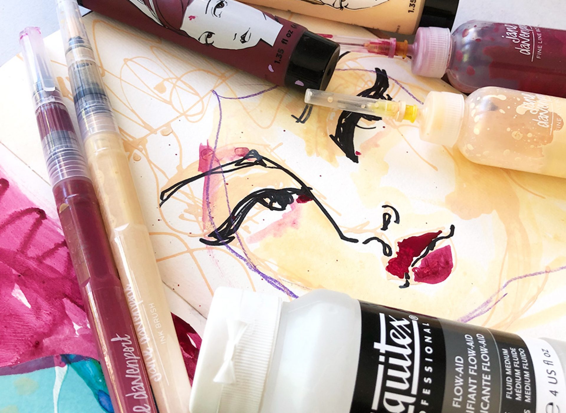
This guest Blog post has been prepared for you by the wonderful Kerry Sinigaglia!

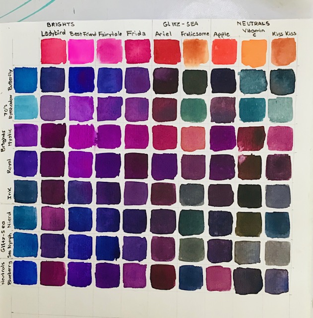
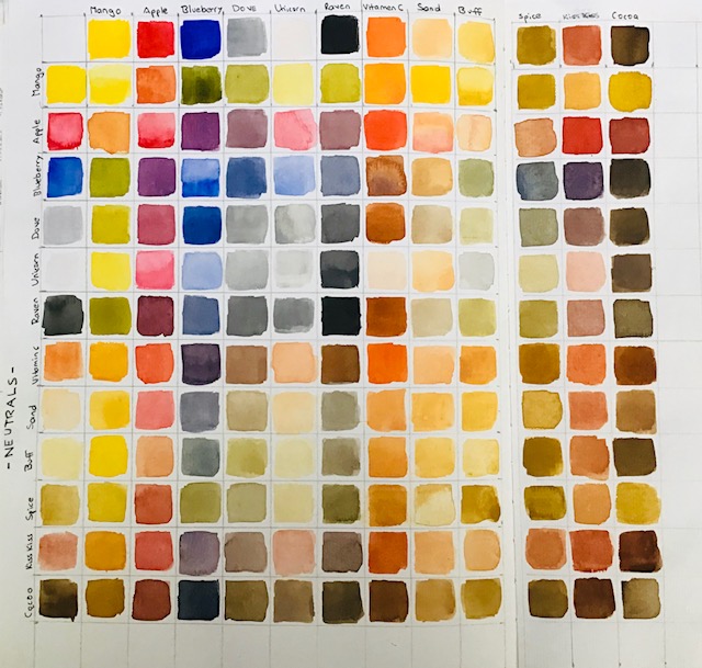
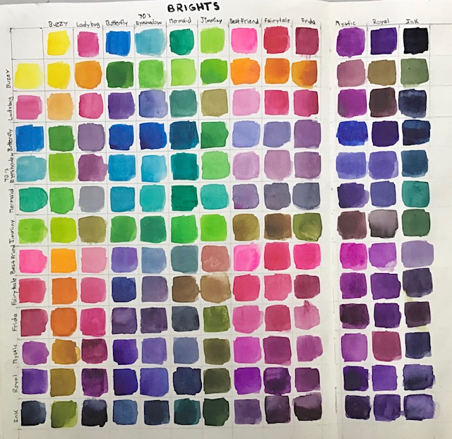
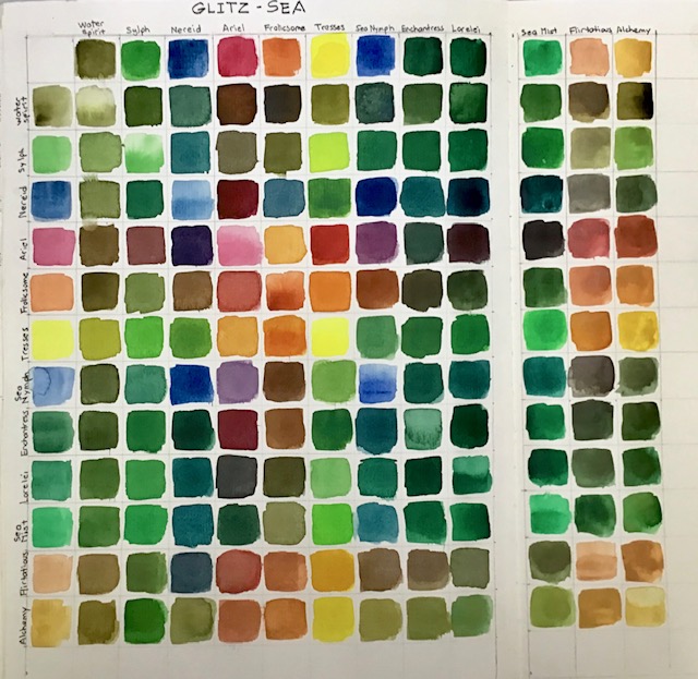
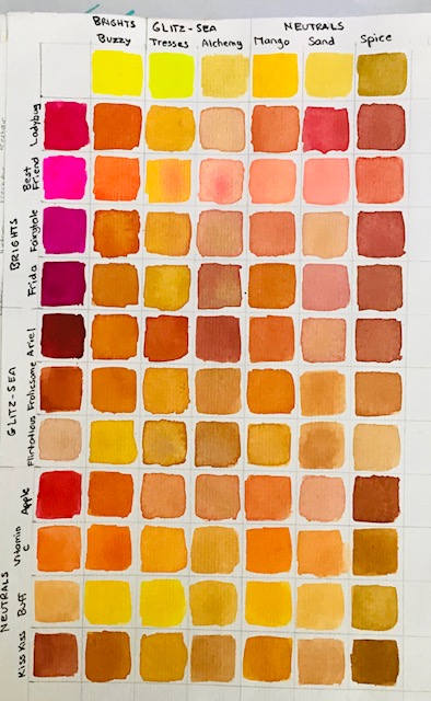
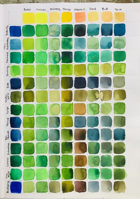
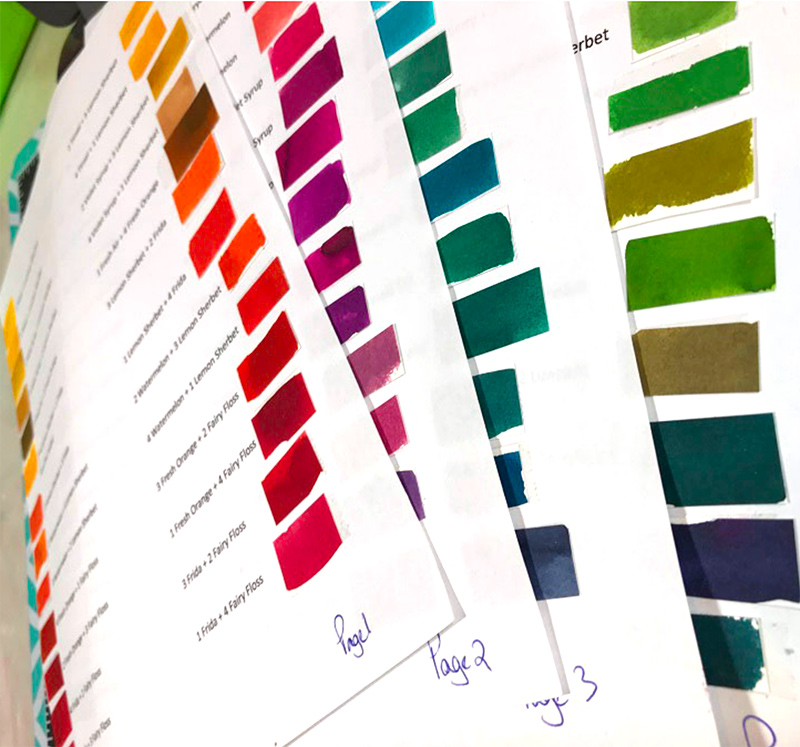
“My intention was to firstly mix some first shades, especially greens using colours from all three of Jane Davenport’s watercolour Palettes.
After quickly seeing there was so much to be learned and so many possibilities for more colours, I sat myself down and spent a few days happily mixing up a whole array of new shades.
These colour charts will be a wonderful reference for when I want to use a particular shade.
The images below take you through the steps of how to mix an entire palette. I used the Glitz-Sea palette for reference here.
The purples, greens and oranges are a mix of colours from the three palettes, and of course, a colour mix chart for the Brights and Neutrals is a must.
I hope that these colours inspire you to perhaps create your own colour mixes or, you can use them as a tool to refer to when you’re reading.
Step 1
Draw up a grid using a pencil. I made my squares 2cm square.
To fit the whole palette in I worked across two pages of my Jane Davenport 9×12 mixed media journal.
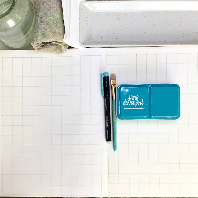 Using a Finishing Line pen to write the names of the colours both vertically and horizontally, you will need to start the top row in one square as seen in the image.
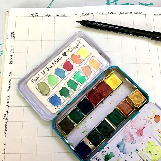 Step 2
Begin colouring each square across and down making the vertical column a lighter, more watered down version.
You can also fill in the square diagonally where the colours will meet in the chart at this time too.
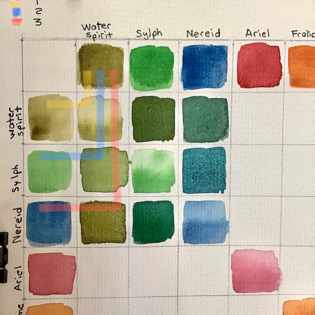 Step 3
Begin the colour mixing working with column 1 from the top row and mixing with the colours down that colour.
As you make your way across the rows you will notice that all colours will double up at some point. I made sure that the ratios were different for each.
This way you can create a navy blue and a maroon using the same two colours in different ratios.
I actually worked the same colour mixes at the same time which can get a little confusing, but once you’ve got into the rhythm of it, it’s easier to see the colour differences and make sure that you’re getting two different shades.
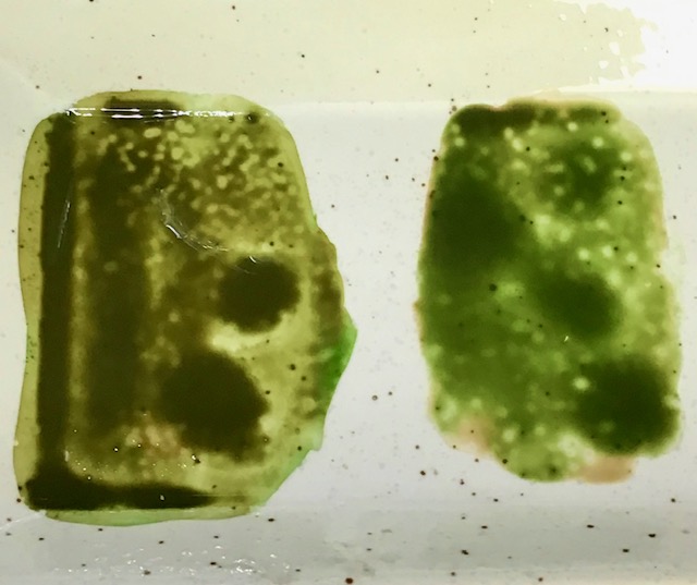
I hope that makes sense. 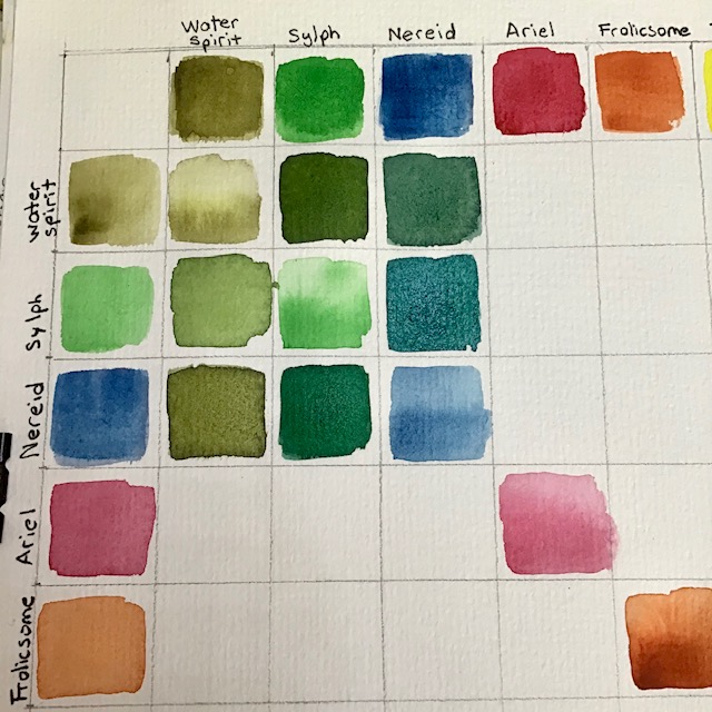 I have marked some of the images to show how “Sylph” ( green) and “Frolicsome”(rusty orange) can make two different shades of green. The palette shows how I mixed the colours to get these results.
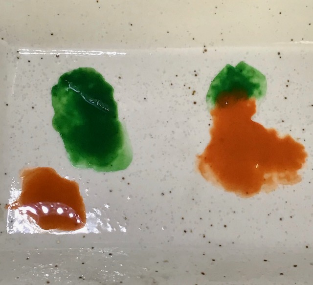
 I hope that you have found the charts and information helpful and you’re inspired to get mixing too.
Swatching is such a valuable use of art time because you learn so much about your chosen supply and colour!
You can see more of Kerry here: https://www.instagram.com/kerrysinigaglia/
xox
Jane


Welcome to my blog Davenpeeps!
If we haven’t met yet, I’m Jane Davenport! I’m a professional artist, art workshop teacher, 5x bestselling author, art supply creator and self-diagnosed art supply addict!
I’m a creativity expert who has guided tens of thousands of women back to their art, defying their self imposed creative gravity and making art with joy and confidence. I share my mixed media art and drawing techniques with everyday artists who feel their creativity calling them to play with colour, texture and their art supplies. I hope my blog can help you embrace the mess, let go of perfectionitis and experience the joy of creativity.
LEARN MORE ABOUT ME >

